Media Technology

TiddlyDesktop

TiddlyWiki, the personal Wiki where you store all your content in a single local Javascript-enabled webpage, now offers a new look: a desktop, complete with movable tiled windows. I’m not sure if this is a good idea or not (I can’t imagine using this look myself), but at the very least it’s an intriguing demonstration of what you can do with just Javascript and Cascading Style Sheets. (Thanks to John for the link.)

TiddlyDesktop Read More »

Annotated blog corpus to be released at WWE 2006

Intelliseek will be a big corpus of spidered and annotated blog posts to attendees at the 3rd Annual Workshop on the Weblogging Ecosystem (held in conjunction with the WWW 2006 Conference in Edinburgh, Scottland):

The data release comprises a complete set of weblog posts for three weeks in July 2005 (on the order of 10M posts from 1M weblogs). This data set has been selected as it spans a period of time during which an event of global significance occurred, namely the London bombings.

The data set includes the full content of the posts plus mark-up. The marked-up fields include: date of posting, time of posting, author name, title of the post, weblog url, permalink, tags/categories, and outlinks classified by type – details may be found here.

Sounds like a great resource for researchers. I’m also amused (in a dark sort of way) by the datashare individual agreement they require people to sign — essentially they admit that there’s no way they can get copyright clearance from all million or so bloggers they’ve collected, so they just ask everyone to agree to remove any posts if anyone complains, not use the results for commercial purposes and not use it passed the workshop.

Annotated blog corpus to be released at WWE 2006 Read More »

GMail “Web Clips” are still context blind…

GMail has added Web Clips at the top of their page, showing RSS and Atom feeds plus “relevant sponsored links” to the top of your messages. Unfortunately, it looks like only the sponsored links are actually relevant (which I read to mean “related to the message you’re reading”). Clips from your own RSS feeds are still just random.

Hopefully they’re busy working on fixing that — I still think automatic annotation of email (and blog entries) with other related entries form a largish set of favorite RSS feeds is a seriously useful application that needs to be exploited. Honestly, I’ve been expecting it to be just around the corner for about three years now, and I’m not sure why I’m still waiting. (I know, I know… if I really want it done I’d sit down and write one myself…)

GMail “Web Clips” are still context blind… Read More »

Let’s hear it for flexibility…

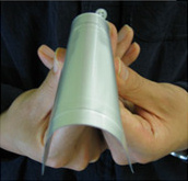
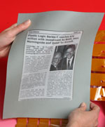
Two interesting technologies have just been announced in the flexible-computing arena. First (via engadget) is NEC’s announcement of their Organic Radical Battery, a 300-micron thick flexible battery with an energy density of about 1 mWh/cm2 and recharge time of just 30 seconds. Then throw in Plastic Logic‘s announcement of a 10″ diagonal SVGA E-Ink display (4-level greyscale) that’s both flexible and less than 0.4mm thick. (Thanks to Kurt for the links!)

nec-orb-flexible-battery.jpg plastic-logic-eink-display.jpg
NEC’s ORB battery Plastic Logic’s E-Ink based display

Let’s hear it for flexibility… Read More »

Very fly

I picked up a Fly Pentop the other to play with (one of the advantages of being a user interface researcher is all the toys :). Here’re a few thoughts.

There’re at least four challenges with using a real ink pen as a computer interface:

fly-pentop-sheet.gif

  1. There’s no way to constrain where the user draws: strokes that should be invalid in your application leave marks just the same as valid strokes.
  2. There’s no way to tap or “drag” without leaving a mark, and no way to erase marks after you’ve left them.
  3. There’s no display to give feedback to your actions or computation. (The Fly uses audio for feedback, which gets around this limitation to some extent.)
  4. You need a pre-printed sheet of paper for every pre-designed interface — the Fly comes with about 15 pre-printed games sheets, everything from word-search pages to maps you can tap on to test your geography knowledge. That doesn’t scale well when dealing with applications with many different pages or when maintaining large numbers of applications, especially given that pages get “used up” when you write on them. On the other hand, the fact that paper is consumable makes for market opportunities that normal software doesn’t have… I expect Leapfrog isn’t too upset about that fact.
  5. If you don’t use a pre-designed interface (that is, you start with a blank sheet of paper) then the user is forced to draw the entire interface. The Fly has one game where you draw a piano keyboard that you can then play by tapping on the keys, but first it gives you explicit instructions like “draw 9 short vertical lines, going from left to right” to make sure you draw a keyboard it can understand.

In spite of these limitations, it’s extremely engaging to be able to draw your own functional user interface — as anyone who read Harold and the Purple Crayon or watched Simon in the Land of Chalk Drawings as a kid knows. The effect really hit me when I was making a calculator. First I wrote the letter “C” and circled it to enter calculator mode. Then, as the pen spoke instructions to me, I drew a big rectangle and started to fill it with numbers and arithmetic symbols. I realized about three numbers in that I didn’t have to stick to the usual layout and placed the rest of the numbers going up, down and sideways. Then I tapped on the numbers with the pen to type out 22 + 44…” only to discover I’d forgotten to draw an equals sign. I quickly drew one in, then tapped it to hear the pen speak “22 + 44 equals 66”. It was as if I were running from something in the land of chalk drawings and someone suggested we draw a door so we could escape!

The interface also feels more magical than it would if it were implemented on a tablet PC. This could be a novelty effect — I’m used to paper being static and non-functional and computer screens being reactive — but I think it’s also because it feels like the pen is reacting to my physical environment, rather than simply reacting to the way I interact with it. When I interact with a tablet PC, I think of the computer as being the screen (even if the actual CPU is somewhere else). With the Fly, I think of the pen and speaker as being the device, but not the paper. That means even though a tablet PC and the pentop computer might implement the exact same interface, I feel more of an emotional attachment with the pen because it appears to be observing and sharing my external environment and not just the actions I perform directly on the device.
Very fly Read More »

Fly Pentop Computer

fly-pentop.jpg
Image: Leapfrog

The NYTimes has a write-up on Leapfrog‘s Fly Pentop Computer, which essentially merges the Anoto Pen technology with a speaker and what sounds like some very clever games & applications, all wrapped in a $100 pen. Supposedly it’s for the 8 to 14-year-old market, but I’m thinking it might be good for this 30-somethinger as well.

(Thanks to Ted for the link.)

Update 11/25/05: I picked one up at Fry’s a couple days ago — here’re some thoughts on it.

Fly Pentop Computer Read More »